U.S. Soccer National Training Center
Client: U.S. Soccer Federation
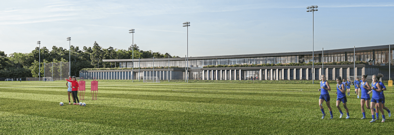
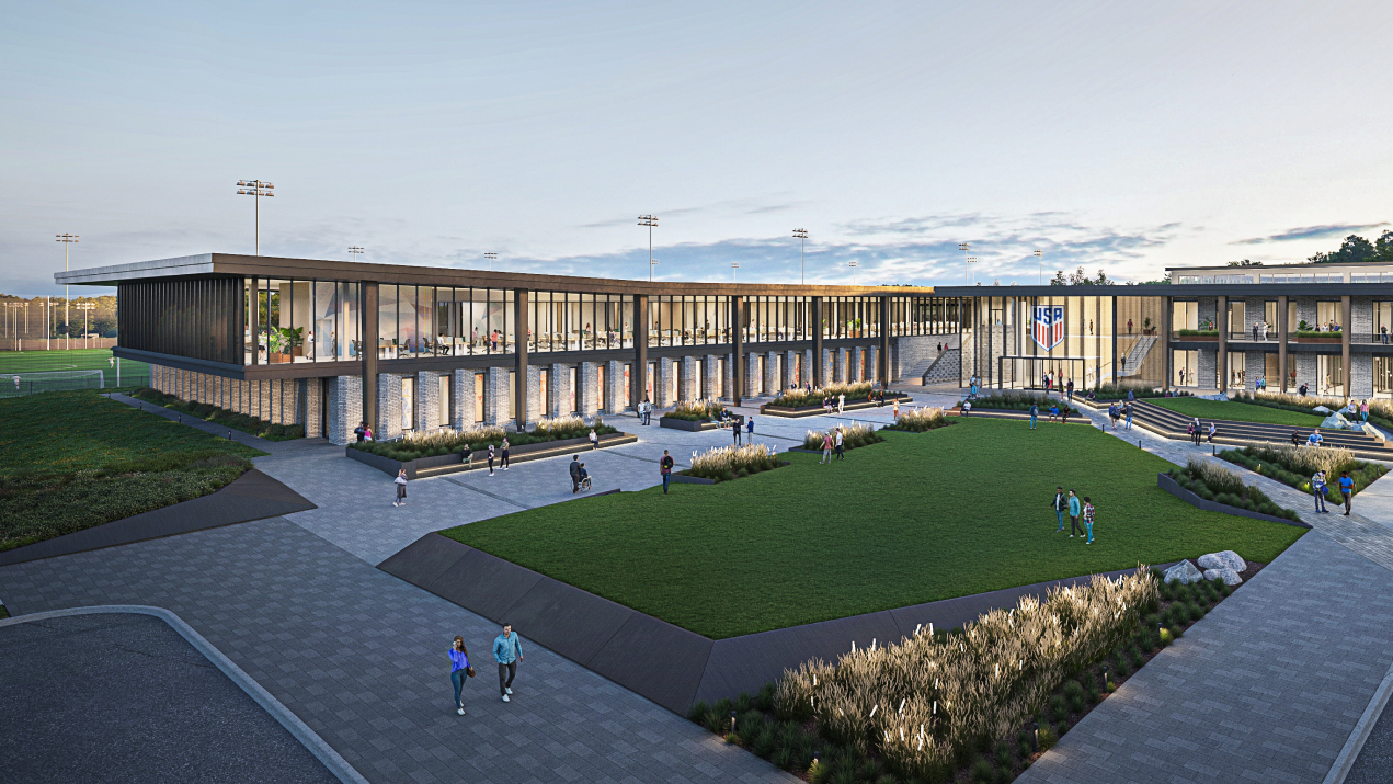
For years, the United States stood out among major soccer nations as one of the few without a dedicated home base for its national teams. That ended with the opening of the Arthur M. Blank U.S. Soccer National Training Center in Atlanta. The center had a name and architecture, but needed a full brand identity worthy of such an incredible place, and so the U.S. Soccer Federation came to us to create something that would rally fans, players and stakeholders around a shared vision for U.S. Soccer.
Sounds like an absolute dream, right? Well, there was just one problem: to brand is to define, and the game and its culture is largely undefined in the U.S.
The Research
Other teams have rooted their National Training Centers’ brands in their country’s legacies and traditions.
Argentina named its facility after Lionel Messi, one of the most celebrated players in the country's history. Brazil designed its communal spaces around the story of players progressing from neighborhood fields to legendary status. And Germany positioned its National Training Center as a "campus" to underscore the education and developmental rigor that define German football.
The U.S. doesn’t have those same roots to latch on to.
The top U.S. professional league, Major League Soccer, wasn’t founded until 1993 - decades behind other countries. And soccer has historically ranked behind sports like football, baseball, basketball, and hockey in the American sports landscape. We haven't had the time or popularity to really make it our own.
But perceived lack of legacy actually gives the U.S. a greater freedom to define the future.
As one stakeholder so eloquently put it, “Other federations are so rooted in their history, their teams have been around for eons, they have their traditions and the ways things have always been done. Whereas with U.S. Soccer, we didn’t have that explosion until the 90s. So we have that newness coming in. We can still define who we are.”
And U.S. Soccer’s lack of deep-rooted traditions actually fosters non-traditional pathways and ideologies.
U.S. Soccer has 27 national teams, which is the most of any Federation. Most Federations have a men's team, hopefully a women’s, and then it's really thin on down from there.
The Insight: In a world bound by tradition, the rapid growth of U.S. Soccer makes it an place of true innovation.
The Strategy: Show the world that U.S. Soccer is where we constantly raise the bar
The Execution
Higher Ground
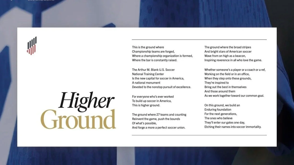
BRINGING THE STRATEGY TO LIFE
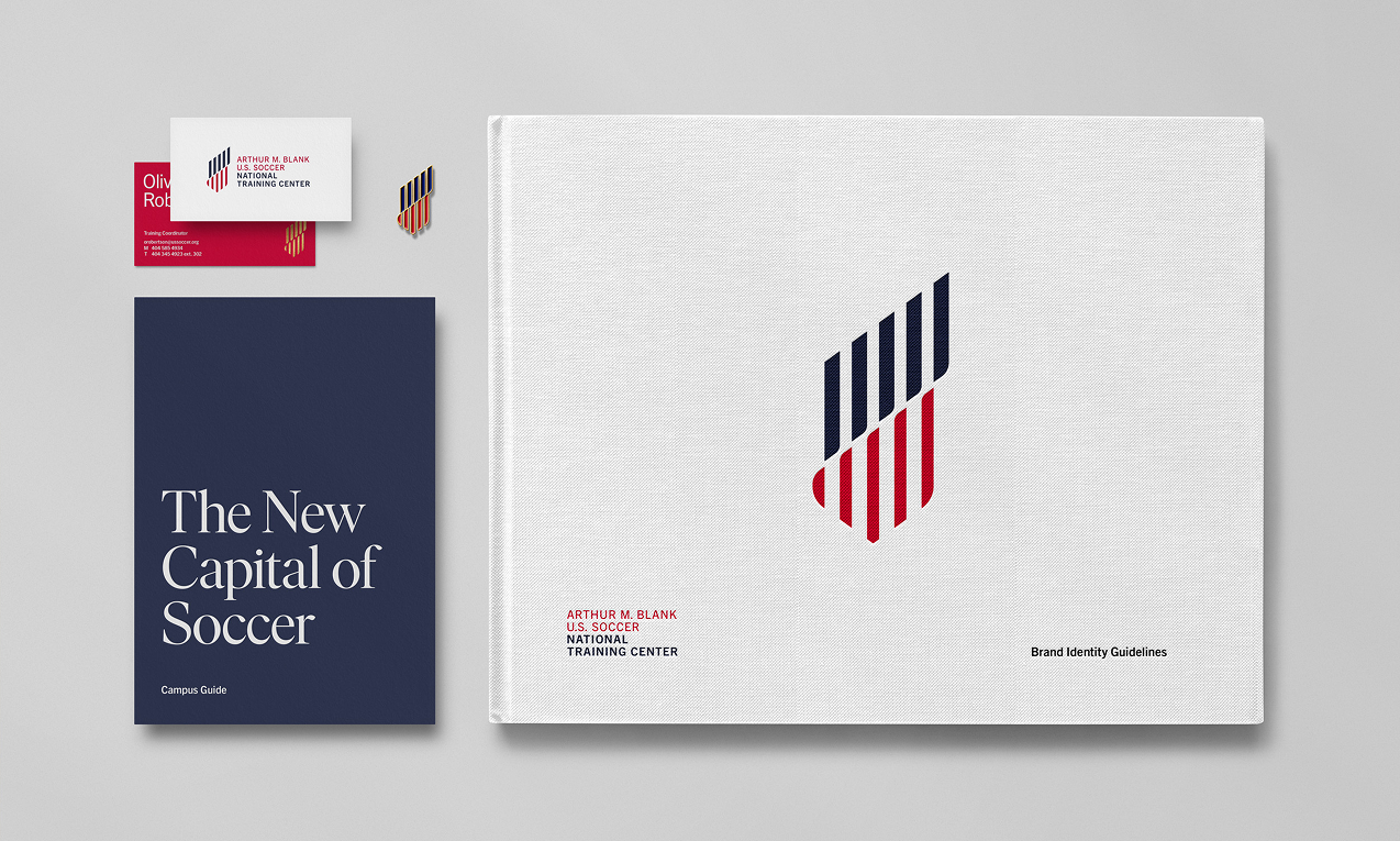
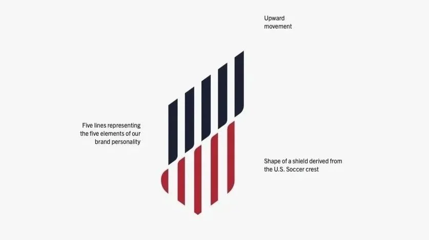
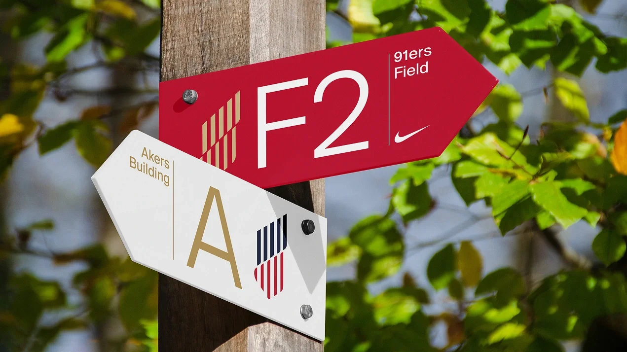
Drawing from the federation’s crest, the American flag, and the architecture of the facility itself, the identity system was designed to feel connected to the overarching USSF brand while also creating a distinct identity that inspired all of the different audiences that the National Training Center serves, from senior teams to youth teams to coaches to philanthropic partners.
The mark’s upward movement symbolizes the American character of the self-made individual. The five lines evoke the five elements of the brand personality:
Steadfast, but not Rigid: Though we exude confidence, we’re open-minded, agile and nimble enough to pivot and redirect while staying focused on our goals.
Courageous and Inviting: We can only lead the way if we invite others to follow. After all, we’re doing this for them.
Inspired, but not Airy: We spread enthusiasm not through empty hype but by grounding our claims in the hard work we do every day.
Relentless, but Welcoming: Expecting the best from people doesn’t make us cold or difficult. We empower people so that they can reach new heights.
Iconic, but not Traditional: We understand that people look up to us, but we walk the walk with style, preventing us from being traditional or dull.
Logo
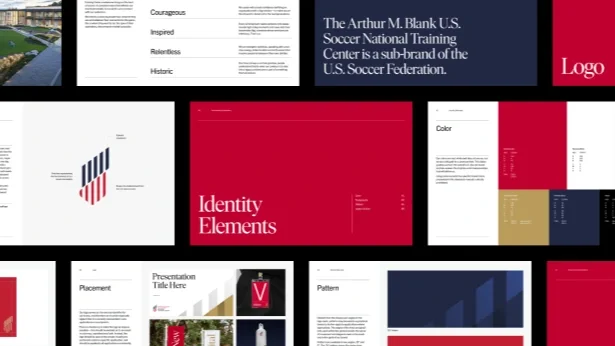
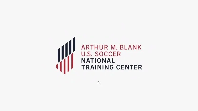
The primary logo uses the mark and wordmark interlocked horizontally. The wordmark is set on four lines of text to make the most efficient use of space and legibility.
The “Arthur M. Blank” and “U.S. Soccer” names are set in a lighter weight and red color, as opposed to the bolder, blue “National Training Center”. This creates a clear hierarchy within the name that also can be seen when the logo is set in just one color.
Color
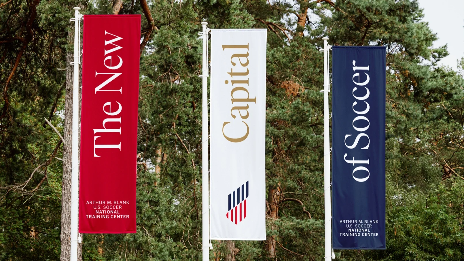
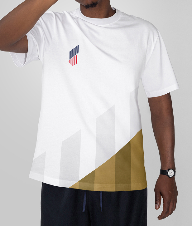
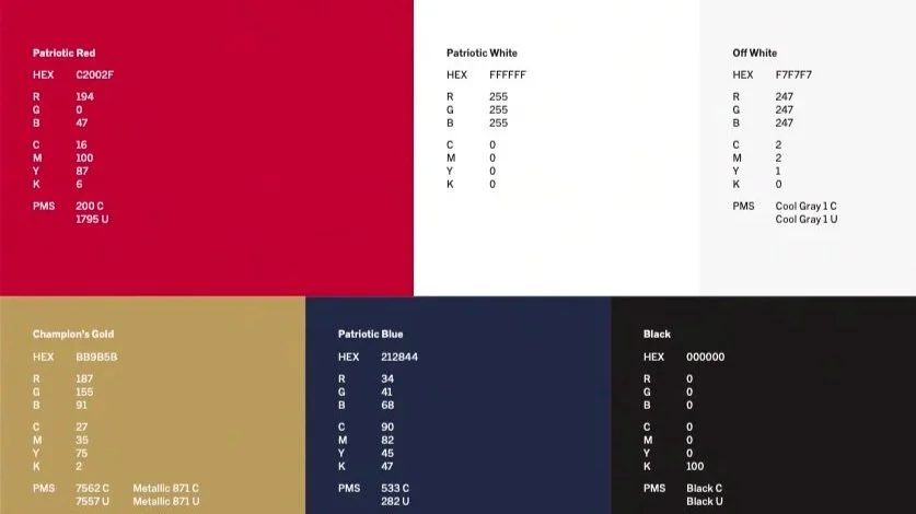
The brand colors chosen were red, white and blue (of course) but we also add gold for a premium feel. This distinguishes us from the overall U.S. Soccer brand and also evokes the trophies and championships that will define us.
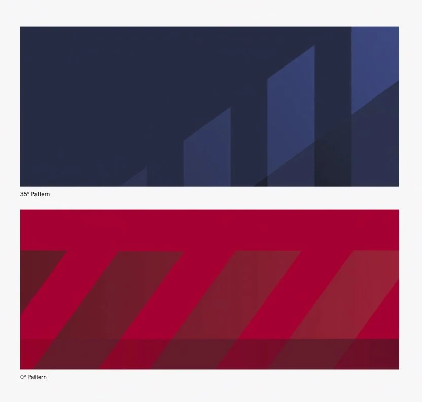
Pattern
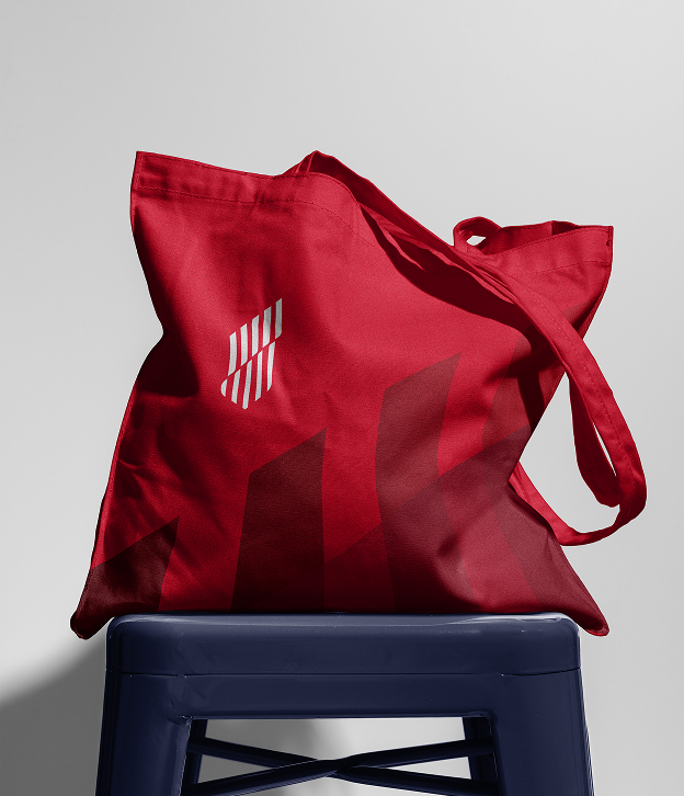
We also created a pattern to be used as a graphical device where appropriate. The angles of the lines and gradients used within the patterns evoke the sense of movement and elegance seen in the mark and in the spirit of our brand.
Photography
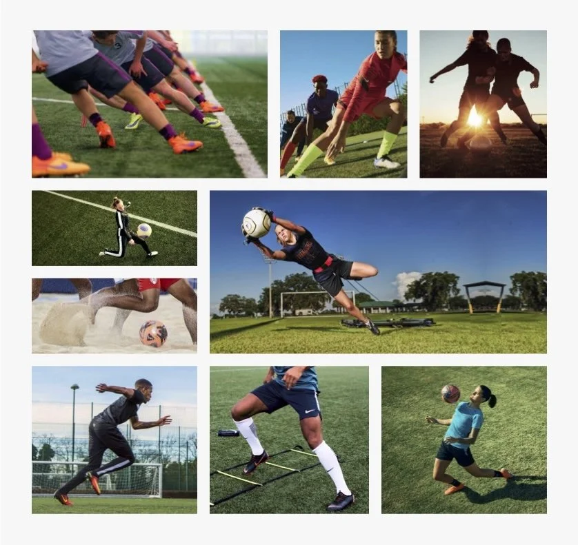
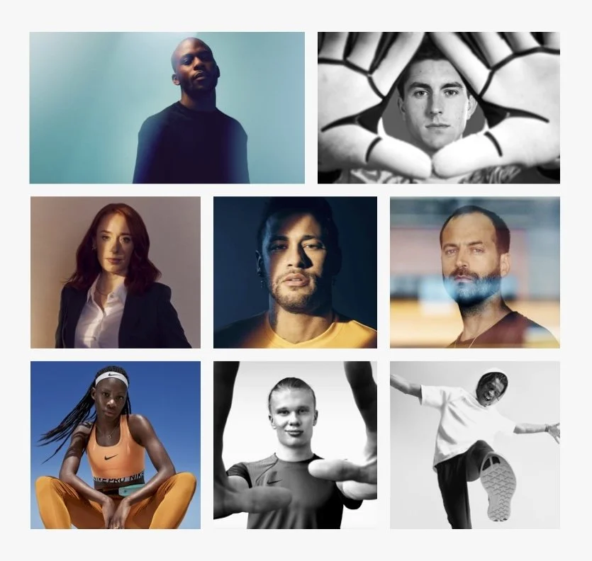
All photography, from the campus to portraits to action shots of playing and training, was intentionally designed to harken back to the mark. Campus shots do that through a focus on the geometry and architecture of the campus (think overhead shots or trees that create a sense of angles). In-game or practice photography do this by capturing the sense of motion. And portraits do this by creating a sense of dimension between the subject and viewer. Some ways of doing this include shoot-through techniques with glass or through framing the shot, a play on light and shadow, layering on top of the subject, or blurring the background for additional effect.

Want to see even more? See the press release here.
Teammates: Thad Goad (Executive Creative Director), Manuel Ortiz (ACD/Design), Thomas Mullen (ACD/Copy), Martin Pohlmann (Senior Designer), Tara Bates (Group Program Director)